



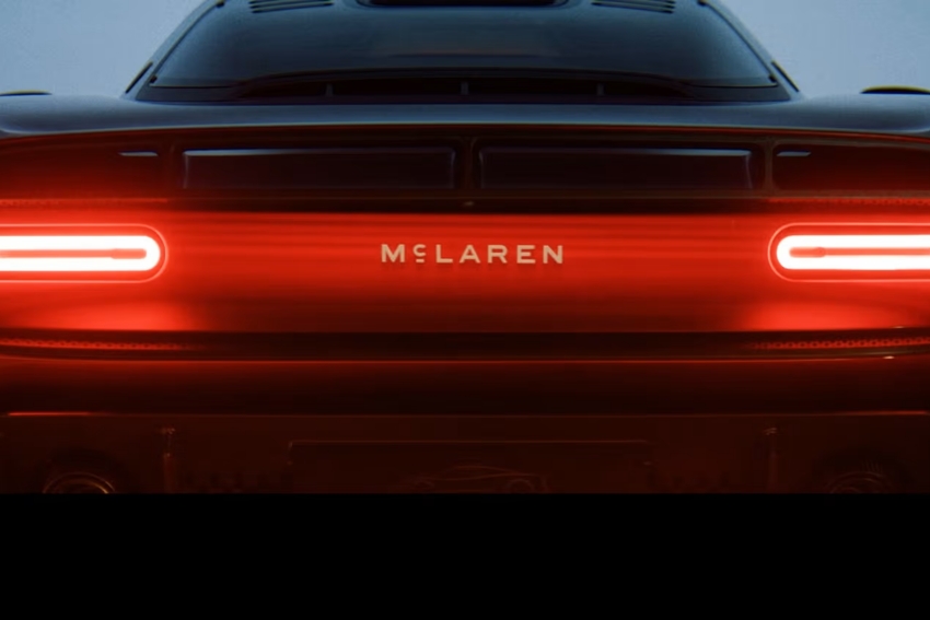
McLaren logo redesign makes the automaker’s wordmark intentionally simple, and it ties the brand back to Bruce McLaren’s family service station in Remuera, Auckland.
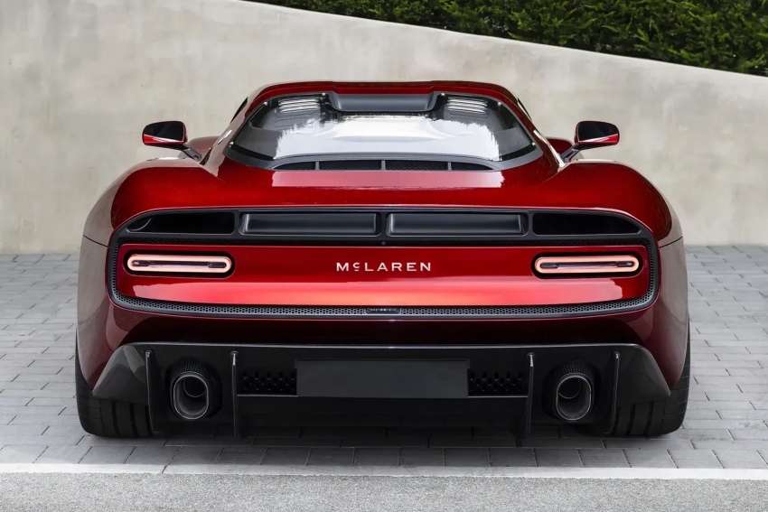
The most visible change in the McLaren logo redesign is typographic: every letter is now uppercase and the name is set in a new proprietary font called McLaren Sans. The streamlined red Speedmark is no longer locked to the main wordmark, McLaren said in a company statement, though it will still be used across the brand.
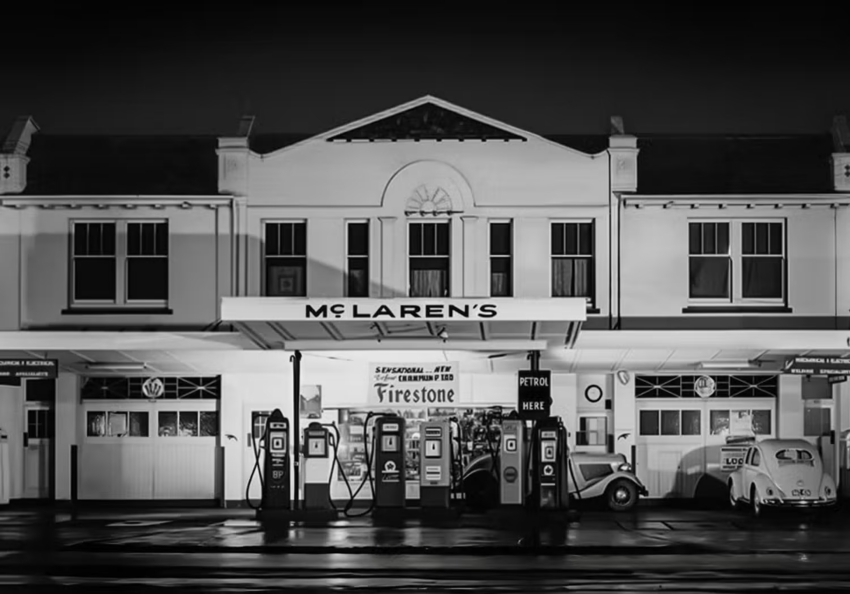
The new wordmark draws directly from a handpainted sign that once hung on the canopy of the McLaren family’s service station in Remuera (a neighborhood in Auckland). Designers preserved the short stroke under the letter C from that original sign, placing a family detail at the center of the brand’s visual identity.
Why the redesign matters for brand story
At first glance the update looks like a typical modern brand refresh, but the McLaren logo redesign is more a deliberate act of historical reclamation than a move toward an abstract future aesthetic. Instead of inventing a new symbol meant to signal high tech, the team reached back to the company’s origins.
Bruce McLaren’s parents, Les and Ruth McLaren, ran the Remuera service station where Bruce worked on the car that delivered his first racing victory. By referencing that handpainted McLaren’s sign, the marque centers a personal chapter of the company’s past in its public identity.
Design choices and what stays
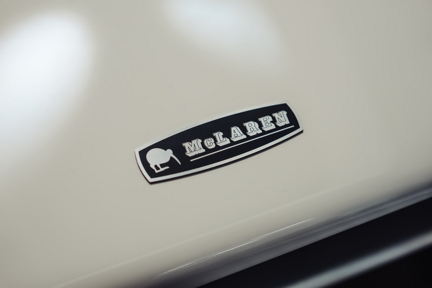
McLaren said the Speedmark and the so called Speedy Kiwi emblem will remain part of the brand’s lexicon, but they will function independently from the main wordmark. The company intends the new identity to be used across road cars and Formula 1 cars, it added, signaling that the redesign is a corporate standard, not a one-off campaign.
The relationship between the red Speedmark and early Kiwi imagery has long been assumed, but the redesign makes the brand name itself the explicit nod to New Zealand roots. From a handpainted station sign in Remuera to the names that appear on modern road and race cars, that thread now reads as a continuous line of identity.
Both McLaren Racing and McLaren Automotive worked on the archive research that informed the change, reviewing Bruce McLaren’s early years in New Zealand and the evolution of the brand’s visual symbols. The result is a wordmark that looks cleaner, and that intentionally places a personal origin story at the brand’s forefront.
What this means for recognition and marketing
If a logo’s job is immediate recognition, McLaren did not need to complicate the mark. The new wordmark, and the preserved stroke under the C, reconnect the present brand to Bruce McLaren’s first workshop, and that historical link will be central to future communications.
The McLaren logo redesign may look like a small typographic tweak at first, but it reassigns the roles of familiar icons rather than erasing them, and it turns a short painted stroke into a key piece of brand storytelling.